Black Rabbit
Design, illustration & photography
Personal branding inspired by the endless summers and the rustic design of vintage southwestern/desert signage.
The initial inspiration for this branding was retro, 1970s design (think bold rounded serifs à la Cooper Black and Goudy, warm colours, and simple illustrations). As the logo and branding exploration continued, the style shifted more towards a vintage, southwestern look.
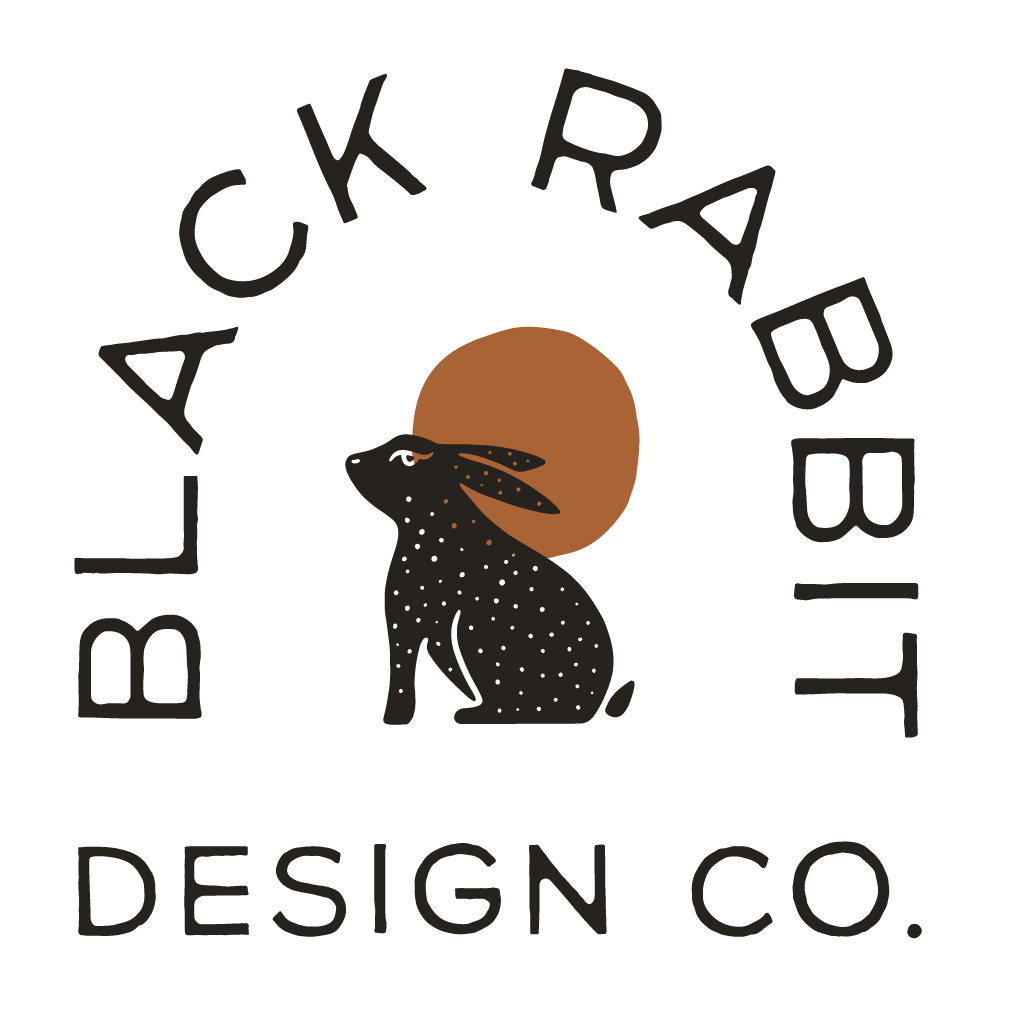
Above is the final logo for Black Rabbit Design Co., which consists of a rabbit illustration overlapping an orange sun, with a simple, rustic sans-serif font.
Continuing on with the desert theme, I chose a muted colour palette for the branding, made up of a faded black, off white, pale salmon, rusty orange, golden yellow, and a dusty grey blue. For fonts, the star of the show (used in the logo) is the simple and rustic sans-serif, CN Agave. I paired this with the serif classic Garamond and the geometric sans-serif DIN Condensed.
Above is the evolution of the rabbit icon. It started with a solid fill leaping rabbit. This rabbit featured no additional details, like eyes or limb delineation, but it ultimately felt too “clean” for the design direction. From here, the rabbit evolved into a simple, somewhat geometric illustration. A second version of this rabbit was made with a different eye design. To match the studio name, the rabbit was filled in with black. However, this rabbit felt too heavy and round. An alternate rabbit design was explored, this one revisiting the concept of a leaping rabbit, but now with additional details. The final design of the rabbit icon ended up being a thinner version of design #4.
Some of the logo lockups I didn’t end up using. While I really liked some of these (especially the first one in this lineup), I ultimately chose the logo I did, as I liked how the simple font and text placement made the rabbit icon pop.


